BlurView
BlurView is the standard, cross-platform blur component. On iOS it uses UIKit’s UIVisualEffectView; on Android it uses QmBlurView for native blur, with a lightweight overlay fallback on limited devices; on Web it uses CSS backdrop-filter.
Basic usage
import { BlurView } from '@sbaiahmed1/react-native-blur';

<BlurView
  blurType="light"
  blurAmount={20}
  style={{
    position: 'absolute',
    top: 100,
    left: 50,
    right: 50,
    height: 200,
    borderRadius: 20,
  }}
>
  <Text>Content with blur background</Text>
</BlurView>
Advanced usage
<BlurView
  blurType="systemMaterial"
  blurAmount={50}
  reducedTransparencyFallbackColor="#FFFFFF80"
  style={{ padding: 20, borderRadius: 15 }}
>
  <Text>Advanced blur with a custom accessibility fallback</Text>
</BlurView>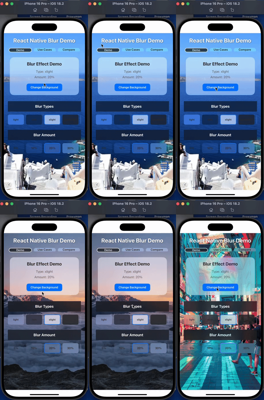
Web behavior
On react-native-web, BlurView renders a backdrop-filter: blur() saturate(180%) layer plus a semi-transparent background tint derived from blurType (all 21 values are mapped to matching light/dark overlays). blurAmount (0-100) scales to the CSS blur radius, and children render above the blur, sharp — the same layering as native.
overlayColorpaints above the blur, below children, like on native.- In browsers without
backdrop-filter(and during server-side rendering), only the tint remains — the same graceful degradationexpo-bluruses. - During hydration, the initial client render uses the same tint-only markup as the server. Supported browsers then enable blur; client-only rendering can enable it immediately.
blurRounds,reducedTransparencyFallbackColor, andignoreSafeAreaare native-only no-ops.- A forwarded
refresolves to the rootView(a DOM element) instead of a native view.
Android behavior
QmBlurView works by capturing the surrounding view tree — scoped to the nearest react-native-screens Screen, falling back to the React root — into a downsampled bitmap and blurring it. Two things follow:
- Capture and blur both cost work. Captures use a downsampled bitmap, and each
blurRoundsiteration adds a native blur pass. Lowering it trades quality for less blur work; measure on target devices to determine whether capture or blur is the bottleneck. - Content drawn on top of the blur is captured too. iOS samples only what is behind the effect view, but the Android capture includes anything rendered above the blur inside the capture root, which shows up as a blurred halo under the crisp original. If the halo shows in a design, move that content outside the capture root (e.g. a portal above the navigator).
Props
| Prop | Type | Default | Description |
|---|---|---|---|
| blurType | BlurType | 'xlight' | The type of blur effect to apply. |
| blurAmount | number | 10 | The intensity of the blur effect (0-100). |
| blurRounds | number | 5 | AndroidNumber of blur interactions for a smoother effect (1-15). |
| ignoreSafeArea | boolean | true | iOSControls whether the blur effect should ignore all safe area edges. |
| reducedTransparencyFallbackColor | string | '#FFFFFF' | iOSFallback color shown when the "Reduce Transparency" accessibility setting is enabled. |
| overlayColor | ColorValue | undefined | An overlay color to apply on top of the blur effect. |
| style | StyleProp<ViewStyle> | undefined | Style object for the blur view. |
| children | React.ReactNode | undefined | Child components to render inside the blur view. |
See the props reference for the full list of BlurType values.